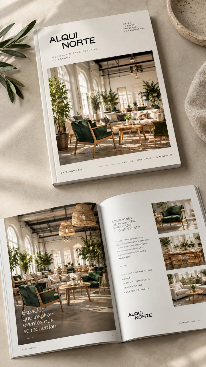
Sipay — case study: UX/UI, Visual communication
A website that explains payments without complicating them.


- Services
- UX/UI, content, communication, social media
- Client
- Sipay
- Sector
- Fintech · Payments
- Website
- sipay.es ↗
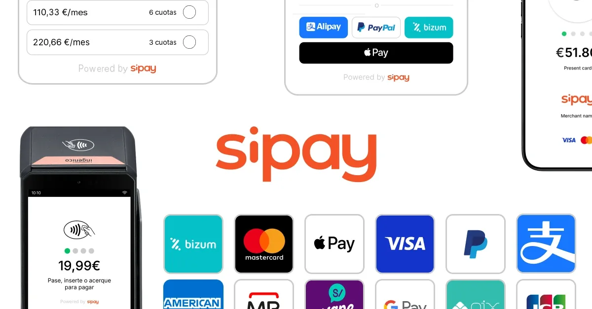
I analysed who the website speaks to and reorganised the offer by needs and by sector — hospitality, mobility, retail, digital, food and subscriptions — instead of by technical product. I redesigned the navigation, the homepage and the product pages around the customer’s business, and added transparent pricing, FAQs and Spanish and English versions. I worked alongside Sipay’s teams, including development, and created social pieces that each carry a single message.
Explaining a very broad offer without the jargon.
Sipay is a Spanish payment gateway with over 30 years of history, 55+ payment solutions and a presence in more than 40 countries, according to its own website. It covers everything from online and in-person payments to Tap to Pay and solutions for hospitality, retail and mobility.
An offer that broad is hard to explain. Shops and companies need to understand which product fits their business without reading technical documentation, and the communication had to convey security, closeness and technological power all at once.
- 01Refresh the website with a clearer, more modern UX/UI approach.
- 02Write copy focused on benefits, not technicalities.
- 03Help every visitor quickly find the solution for their sector.
- 04Carry the same message over to social media.


sipay Simpler payments for your business.
An offer organised by needs and sectors, not by technical product.
Strategy & UX
- Target audience analysis
- Reorganisation by needs and sectors
- Navigation, homepage and product pages
- Spanish and English versions
Content & communication
- Benefit-led copy
- Social media pieces
- Visual walkthrough of Tap to Pay
Design
- Website UX/UI design
- Transparent pricing and FAQs
- Collaboration with Sipay’s development team
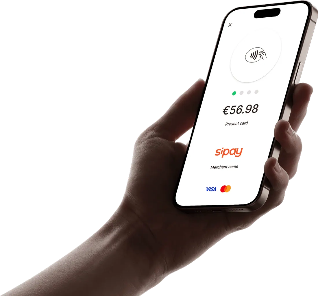
Products understood by what they bring to the business.
Sipay now has a clearer, more consistent website where products are understood by what they bring to the business, in two languages and with direct routes to sign up or get in touch — plus social communication that repeats the same message in the same voice.
- 6 sectors to guide each visitor
- 55+ payment solutions presented (Sipay’s figure)
- 2 languages: Spanish and English
- 1 single message per social piece